


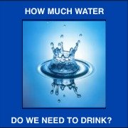
Water and salt are essential for optimal health. We need to drink water and take electrolytes (read: salt, potassium, magnesium and others...) every day in order to live. Follow the WaterCures protocol (to manage your fluid and electrolyte balance) and you will have better health.
Consider this: What do most domestic animals and wild animals drink to maintain their best health? What is their go to drink for hydration? Yes, simply water.
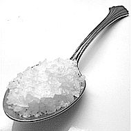
Just Like Fish We Need Salt & Water To Survive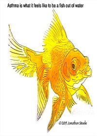 Even Fresh Water Fish Need Salt |
The Water Cures Protocol may help you...
Learn how to coach others using the Water Cures Protocol.
| Water Cures: The Oral Version of a Saline IV 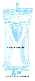
|
Here you will discover the science of how water and unprocessed salt is part of the natural cures protocol that works. This is based on the research of Dr. Batmanghelidj, and his life work in Your Body's Many Cries for Water. We are constantly adding the latest scientific findings to help you grow your knowledge base.
Included is the common sense approach of holistic health care. You will learn how to become a savvy health care consumer.
When possible, links to the scientific research going beyond and improving upon the work of Dr. B. will be provided. Information from these studies will enhance your understanding and improve your ability to use the original research by Dr. B.
Finally, science is starting to recognize the mind, body and spirit connection to all we do. To help make this connection, motivational tools to help you follow through and succeed in becoming an educated consumer will be provided for you.
Please send them in so they can be included in the Water Cure FAQ page.
Want to speak to holistic health hydration coach? Contact us.
Want to be a Part of the Water Cures? Participate and help us spread the word.
Want to be a Water Cure Hydration Coach Discover how you can help others to use the water cure and improve their lives.
Contact us.
Like what you are finding here? Give your feed back, tell your story.
Help others with your experience. Just fill in the information below and we will get back to you soon.
Jul 07, 19 05:23 PM
Oct 25, 18 09:38 PM
Apr 16, 18 09:26 PM

October 22, 2018...
Robert Butts, founder of WaterCures.org passed away at the age of 83. He will be missed.
 |
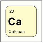 |
Warning: Research shows calcium supplements may be harmful to your health.
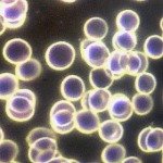
| Fixing Blood Disorders
Posted December 2016 |
 |
It is amazing how so many things that are new to us were common knowledge in the past. One basic practice of the Water Cures protocol is to drink at least 30-45 minutes before and 2 1/2 hours after a meal. This is not a new thought however. Notice what a magazine from 1925 had to say...
"Drink plenty of water two hours after each meal; drink none just before eating; and a small quantity if any at meal time. Do not take a bath until two hours after eating a meal, nor closer than one hour before eating. Drink a full glass of water both before and after the bath." (Golden Age, Sept. 9, 1925, pp. 784-785)
 |
| Hand Joint Pain: How Can I Make It Go Away? |
 |
 |
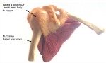 Shoulder Joint Pain Relief Shoulder Joint Pain Relief |
 |
 |
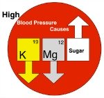 High Blood Pressure Causes High Blood Pressure Causes |
 |
We started expanding on the causes...
The weirdest...chimney sweep cancer. You won't believe where it strikes.
Our theory on...
Healthy Hydration for Athletics & the reason for hydration guideline failures in the past.
We speak to organizations small and large, private and corporate.
Our scientifically proven training works to improve performance and decrease lost days due to illness.
We are currently speaking to hospitals to train staff in ways to decrease the readmission rates in several disease processes that pose high risk of <30 day readmission.
We can cut the rates by up to 70%. Ask us how.
Nurse Jon for more information on hydrating to improve performance.
We are not promoting increased salt intake. We are suggesting taking salt in amounts appropriate to your bodies needs, based on water needs. Our needs are not one size fits all.
Note: Do you have CHF or Kidney Disease? Then.....
THIS IS NOT FOR YOU.
 |
 |
A Review of the above JAMA Article
Study: Salt May Not Be All Bad?
Listen to your body. Do not use this if you are under a doctors care. Do not stop taking medications without consulting your doctor. If you are on medications, consult your doctor if you start the Water Cures Protocol as it may change your needs.
 |
 |
 |
 |
 |
Like What You're Learning? Please share your likes on Facebook

|
There is no treatment that will work for everyone. Even with the Water Cures, we have found that the response varies.
Most who have used water cures have found that it helped them lose weight, improve mental alertness and thinking, alleviated pain and improved the diseases or conditions they faced.
 |
 |
 |
 |
We are not selling anything. We are so sure it works that we can offer a 100% misery back guarantee with everything we share here.
If it works for you or not, let us know.
Hi, my name is Sharon. The webmaster of this site is my nurse, my personal water coach and my husband.
As this site was first being built, I had a headache and as usual took an Ibuprofen. Impatient for it to start working, I decided to try the Water Cures. I took a pinch of salt and a glass of water. Then I took a second pinch of salt and another glass of water. My headache was gone in less than 5 minutes.
From my personal experience, it usually takes 30 to 45 minutes for Ibuprofen to work. Some have found it takes ibuprofen 24 minutes to start working.
Yet on the Water Cures protocol, my headache was gone in 5 minutes.
Its simple: give your body what it needs and your body will give you what you need, the ability to feel great.
Water Cures was the solution for the elimination of my headache. It is what I will use from now on.
Why not give it a try yourself.