Color in Power Point Presentation

Tap the Power of the Psychology of Color Use?

Color psychology helps us to understand the affects and beneficial ways of using color. The way we use it affects the way people look at us. It affects the respect they show us. The choice we make regarding our clothing can have an effect on our credibility and believability.

Educated and appropriate decoration of displays and handouts as well as Power Point Presentations can enhance the quality of a visual presentation. This is where anyone can go from ordinary to "Built Like No Other In This World" with out a large expense.

Audience First

    To accomplish the “Like No Other” style requires first recognizing your audience and what are their needs and listening or learning style.

    Second: what is your purpose, what do you hope to accomplish.

    Third: What color psychology factors relate to your goal? And fourth: lay out and design principles to enhance learning such as discussed in Power of Three.

    With any of these, if you branch off to read them, just hit the back button to come back here.

    In psychology, the study of color and its effect on the mind, and body is vital part of speech mastery. This even becomes more important for those who use Power Point. It also plays a role in hand outs and stationary visual presentations we use.

Basics First

    Before looking at the individual meanings of red, blue, green, and so forth, consider the overall psychology. Look at the basics like hue, saturation, harmony and brightness. Then see an example of fatiguing caused by bright orange and soft blues. Finally look at factors like age, gender, cultural and physiological factors that govern this science.

    This will be followed by an experiment where you can try to change your body temperature using blue or red. Yes, change it by as much as several degrees. This is a truly powerful science.

The Power of White

    You may have read my story of how a patient asked me, on entering the room, if I was the doctor. The doctor, standing across from me and dressed in street clothes said, "No, he is the guy who keeps you alive, he’s your nurse."

    I was wearing a lab coat and dressed in dark blue scrubs. He was wearing a light top and slack. This happened, in part, due to what we were wearing. But also in part due to the professional white I was wearing.

Color Psychology & Power Point: What Should a Presentation Wear?

    How can we best dress our presentations? Our use of and recognizing the power of color psychology can have a similar result with our patients, the audience. They can affect people at the deepest physical, psychological and emotional levels. Having an understanding of this psychology will help narrow down the closet full of clothes in deciding how to dress.

    Go back to the hospitals and you will find nurses dressed according to studies that show certain pastels are soothing to people. Restaurants and gambling casinos will decorate based on how reds will affect the mood of the dinner guests and spending habits of those gambling.

    I have even worked in factories that painted walls based on the psychological calming effect of a certain green would have on the workers. They pay thousands for consultants who create designs for what will be the most psychologically profitable concept.

    Shouldn't it be worth some attention and time to learn the basics?

First a few color psychology basics.

    Red, Yellow, and Blue: more than the sum of their wave lengths.

Brightness: is it dull or sharp and clear

Saturation: is it washed out or deep and strong.

Hues: what color is being perceived

Harmony: complimentary (those on opposing sides of the color wheel)

    Sometimes colors placed next to their complements will tend to produce a vibrating and energized effect. This feeling is caused by an effect called color fatiguing. With the combination of color striking a portion of the retina long enough, the optic nerve begins sending confused signals (the vibrating sensation) to the brain. To prevent this psychological mental process, separate the combination with a thin black line.

Gestalt psychology and Art

    What does it do for you? Notice the dark blue line in the middle making a separation.

    Gestalt Psychology is a theory of how the brain is holistic when it comes to self organizing tendencies. FIY: The saying, the whole is greater than the sum of its parts comes from gestalt psychology. It was Kurt Koffka who originally said, 'the whole is other than the sum of its parts.'

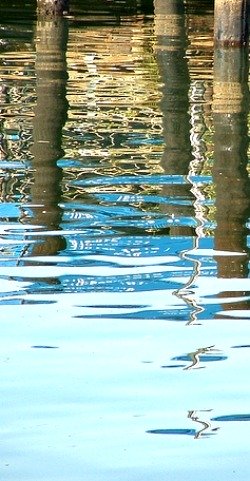
    How does your eye organize the photo below?

    In this cross section of one of artist Jonathan Steele's abstract photographs, what do you see? In the picture, which is the object and which is (back)ground? Do you see some depth between items? How far would you imagine the distance to be? A few inches or more?

    As you read on in Gestalt Psychology you will understand why you see some depth. This is a photograph of crushed metal. The subject matter was as flat as a pancake. This demonstrates the power of this psychology and the understanding it brings.

Color Psychology: Preference and Stimulus/Effect:

    Preference relates to what we like. It is the same as a special song for a given setting or mood or a food or drink. Our preferences can change for time of day, situation, and lighting. Preference is centered in the personality affect.

    Stimulation, is the results it produces on mind, body, and spirit.

    The stimulus and effect seem to be universal and cross cultures except for white and black. That means as humans we will all have the same physiological and psychological effects for the same colors as people in other parts of the world.

    Blues will feel cool and reds & oranges will feel warm.

    There is one exception to this finding. There are East/West differences relating to white and black. There are cultural differences related to marriage dress and funeral dress that will have strong emotional differences as well.

    Recognizing these two aspects of this psychology is an important first step preparing a presentation to best serve the audience.

Consider These Facts

    The human eye can distinguish over 1000 shades of white.

    We can distinguish 7 million different colors.

    Computer monitors can display over 16 million.

    There are only 150 discernible wave lengths of light.

    Only a few really matter.

Gestalt Psychology Relating to Color

    Gestalt Psychology deals with the mental organization, especially with patterns. The organization of figure and ground (as in background) phenomena is one of the primary principles. Those principles play an integral part of this psychology and how we view the variations of the spectrum.

Object and Ground

    In our mind we will see relationships of one to another depending on the end of the spectrum of light they come from. A warm orange will appear closer than a cool blue. So where designs use warm colors for the foreground and cool for the background the mental perception will be depth.

    Warm reds, yellows and oranges will tend to be figure or object. Cool greens, blues and purples will tend to be ground as in background.

    Black and white are visualized as ground. This is why images in black and white go back and forth in our mind as to which is object and which is background.

Age related preference :

    One study (Pre 1976) showed those 65 to 89 preferred bright primary, secondary, and tertiary colors over pastels. This could be from age related decrease perception of intensity.

Gender Preference

    Males and females have unique age related differences.

Cultural preferences:

    Many articles on color psychology limit the differences to east and west for obvious reasons as you will see. Those differences are more geo-local than that. Informal surveys of adult Puerto Rican men and women would have a slightly different preference than a population in Florida. Florida would be vastly different from New York City.

Preferences are not stagnant.

    They change with time and our mental growth. Look at the difference and how dull things were in dress and even cars from the 20's through the 60's.

    This creates a challenge with a common sense solution. Do you try to appeal to the person’s preference or difference? It might be beneficial to advertise in New York with Florida's pastels rather than ones preferred locally.

'Close Psychology' Relatives

    There is a related science called chromo-dynamics. This is a study of the effects of color respectively on the mind and on the body. The writings on these subjects tend to be quite scientific and take the psychology of color to the frontiers of knowledge.

    My nursing class mates were skeptical about these psychologies and the effects that could be produced in mind and body.

    I had two fellow students take my heart rate, one over my heart and one on my wrist. I thought of the cool colors among other things. My heart rate when they first took it for one minute was 72, about my normal. Within a few minutes it came down to 60. (My resting heart rate is in the low 60’s.)

    Then an even simpler test of the effects of cool blue. Holding a thermometer and looking at magazine picture cool blues and warm red's and oranges to raise or lower body temperature.

Art 101: If the psychology fits, wear it.

    Color has power to motivate. Exposure can stimulate or depress, warm or cool.

    There are even stories of how offices were painted certain colors and felt to be too cold or too hot depending on the color even though the temperature remained the same.

    Use of color in presentation needs to be sensitive to the geo-local make up of the audience. Things like culture, socio-economic, age, and even gender, factors could be factors in the final choice.

    As with all presentations, consider your audience first. Whether creating a back drop for your speech if you have a choice, your demo tape, or a back drop for your Power Point Presentation, you need to get a color that fits your audience.

Cultural Colors

    We wear black suits to funerals and formal events. Although a formal color, it is hard on the eyes if used as a back drop for a presentation. Use caution wearing black or white if you’re dark skinned.

    I attended a Color Me Beautiful seminar with some fellow speakers. A friend was first to be demonstrated on. A white cloth was draped around his neck. He had charcoal black skin. The extreme white made it look as thought he didn’t shave prior to the event. No, he looked even worse than having not shaved.

    Only thing, he had shaved. With that knowledge, a different white was used and now he looked more distinguished. How it looked next to his skin was one factor. How we look next to the shades and hews we choose in our presentation could make an important difference.

    This will require objective critiquing to get the best mix. In addition to your presentation, coordinate your self to your presentation.

Socio-Economic Factors

    Studies have shown blue collar workers prefer the basic variety we see in the rainbow. However the greater the education level, the more chance the name of the color will sound like some French pastry.

    This can be well demonstrated by following the money. What kind of signs does McDonalds, Wall Mart, K Mart and Sam’s Club have. What colors do they use? Who are their target markets?

    If you said the poor, that is not entirely accurate. In the book "The Millionaire Mindset" it was noted that the truly wealthy tend to be simpler. They buy from Wall Mart and Sam’s Club. It is those who want to look like they are wealthy but who are addicted to spending who tend to go for the flash and glitz.

    It is here I have developed some of my own psychology theories. My curiosity makes me wonder about the various shades and hews used in the creation of tools for the trades. Does a carpenter considering the purchase of a new Dewalt drill driver and put it in his holster asking himself, "Does this yellow make my hips look big?" Do guys find it hard to accessorize with Makita Blue? The big one, do Milwaukee tools work better because the red gets you energized? The placebo effect is powerful. Hey, it is just a theory, but it can make you wonder.

Grown up Colors

    Adults prefer more subtle colors in their comfort zone. Look for patterns of how people paint their houses and paint choices inside of their houses. Look at the carpet choices. Allowing for the socio-economic factors, they will tend to be earth tones, including blue as it is one of the colors of water. Here too, they will be a bit subdued.

    Kids like bright splashy. Look at the cartoons designed for our little ones. For them, the brighter the better. Just look at the toys made for them. You get an idea of the colors that work for children as an audience.

He Likes, She Likes.

    Men tend to like the cool blues and greens both dark and light. Women on the other hand like warm red and orange. What comes to mind when you think of lipstick.

Don't Forget The Color Blind

    Don’t forget some in the audience may not be able to see what you want them to. There is so much on this if interested, check out one of the encyclopedia sites for related information.

    Especially note that the use of red flashing lights has been linked to epileptic seizures. If you want to avoid a scene in addition to your presentation, avoid this color at the best and avoid flashing of it at the least.

    An interesting study over several decades ago at Yale demonstrated which lights was the biggest villain of slowing down mental process, the problem solving ability, slowing, social conversation and decision making ability. The guilty party was red. It even increased hand tremors. It was followed by green.

Continuity

    This is an important one. In the field of color psychology, the relationship of how many and the coherence of color is often overlooked.

    Breaks in continuity are essential to prevent boredom. Fractionated atomized designs have the effect of fictionalizing those who work with or around those design patterns. What this means, for a power point presentation and hand outs, a unified concept of color and design is best. Variations could be used dramatically if they progress through out the presentation. However it is important that the same theme be followed.

Closure

    Color has a relationship with objects in our mind. According to the work of Dr. Deborah T Sharpe there needs to be a physiological closure with the use of colors.

    If a sofa has one chair we look for another. If we see a table with 3 chairs, we look for a fourth. However in the design world it is odd numbers that rule. Groupings of three, five and seven rule as best practice.

    So best practice requires a similar mind set with the use of color. Rooms having predominantly warm reds and oranges will cause us to look for cool blues and greens. The theory is that a warm colored room absent of any cool relief will make you feel thirstier.

    Color is not only part of who we are. It is vital to life. People who live in environments devoid of the variations of the spectrum, hallucinate color. A lack of it is associated with slowing development of children.

Size of...

    Just as color can change the perception of size of a room, it can do the same with the perception of the presentation. Bright ones will jump out at you where as lighter ones will recede.

    Although trying to make a comprehensive overview of this psychology, there is much left said. It is a fascinating science that is still on the frontiers of knowledge.

    If you haven't been there yet, check out color meaning. In addition to the psychological implications mentioned here, there is much to be said about the meaning of each member of the spectrum.

    For instance, how would you decorate if you wanted your visitor to be thirsty. What choices if you wanted the visitor to be bold in making decisions. There is still more to learn.

Try An Experiment With Red and Blue and the Temperature of You

    Try it for your self and see the power of blue and red.

    Take a thermometer you can hold between your thumb and index finger and get a reading.

    Your body temperature will be between the mid 70's and 95 degrees. Now start thinking of blue or red, depending on which way you want to go first.

    If blue, imagine your feet hanging over a dock into the blue water of a lake. You look up and see the blue sky. You feel a clear breeze blowing over you.

    If imagining is hard then immerse your self in magazine images and pictures with these colors.

    Don't be surprised if the first time you do this you get an opposite reading than you want. This has to do with performance anxiety since you will be trying harder.

    If the first time you do this, you can get several degree change you have done very good.

    The point of the experiment, to demonstrate the physiological power something as simple as powder blue paint can have. Or the thirst oranges and reds can produce.

    Recognize too, the cultural differences that make each of us unique. Enjoy those differences, drink them in.

    If your children want to do this as a science project, they will need scientific references. You will be able to find those in a book, Whole Brain Thinking by Jacquelyn Wonder and Priscilla Donovan -- Morrow 1984

Speechmastery.com: The Public Speaking Color Website

Lets Connect View Jonathan Steele RN Holistic Nurse's profile on LinkedIn
Better Public Speaking Tips

How Much Water You Drink Can Affect Your Performance!

Click Here Discover The Science of How Much We Need to Drink and The
5 Rights of Proper Hydration

Water Cures Protocol